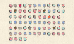
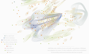
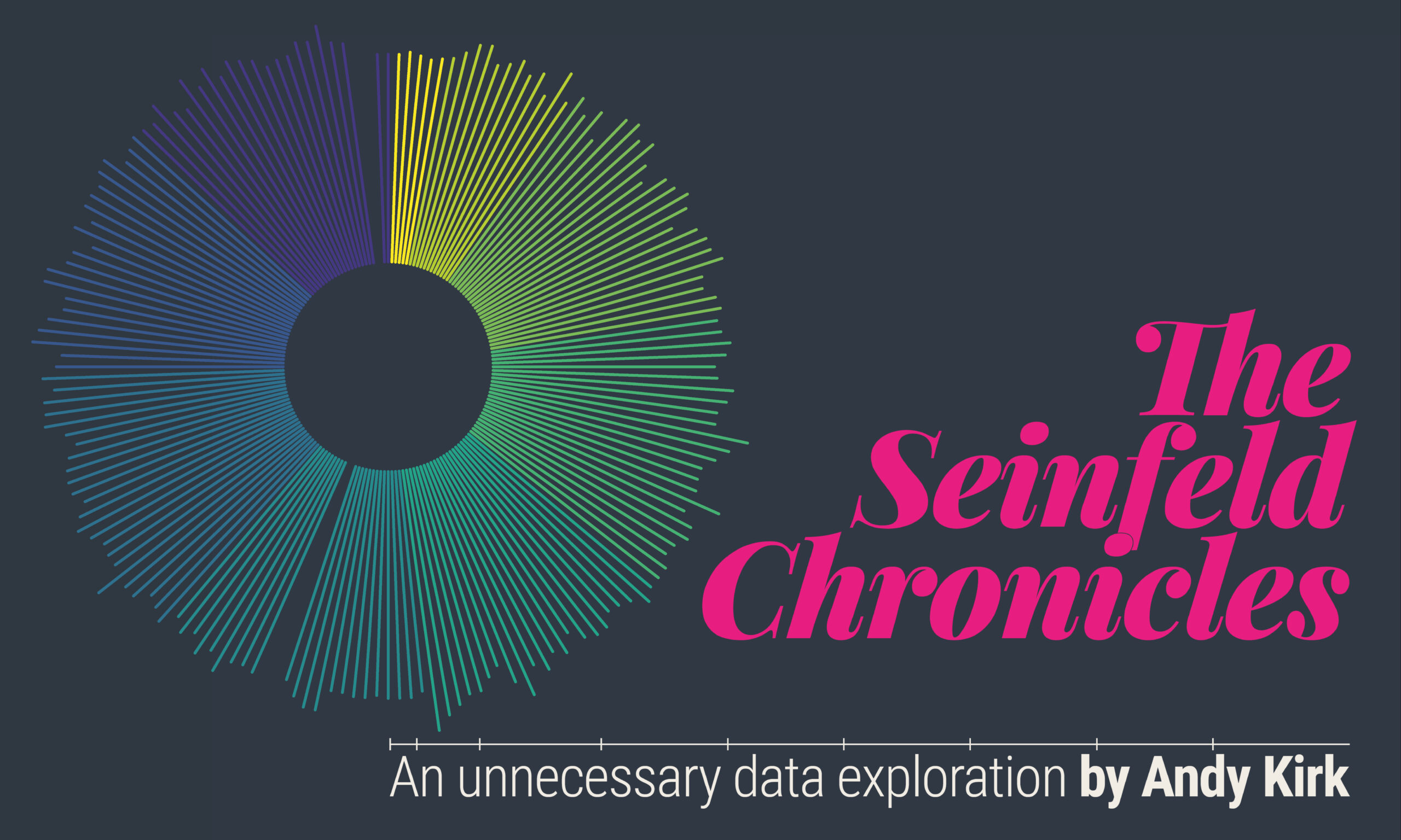
WORK PORTFOLIO

This is a portfolio of work examples that characterise the wide range of my professional and public services, including learning resources and collections, as well as one-off personal projects. Not all commercial projects can be shared publicly but the work that is shown is created and shared with the motivation of spreading knowledge about good data visualisation practice. Click on these navigation buttons below to jump to the relevant sections below.
Resources & Collections
More details coming soon…
Personal Projects
More details coming soon…
CONSULTANCY


A motivation to help client organisations get more from and do more with their data themselves is at the heart of the range of visualisation design and consultancy services I offer.
The emphasis is always on offering best practice advice and assistance for developing client capabilities and solutions to their visualisation challenges. Rather than have data visualisation done to you, my motivation is to help you do it for yourself. My consultancy offerings include the following type of engagements:
- Data Visualisation Evaluation – Reviewing existing visual products (reports, graphics, projects) and providing expert advice on recommendations for potential improvements and enhancements.
- Concept Design Specification – Developing concept design specifications and/or providing detailed recommendations for visualisation solutions fit for an organisation’s purpose and context.
- Facilitated Consultancy – Often an engagement that works as a companion to a training workshop, this service involves helping clients/organisations lead on developing their own potential solution to a workplace challenge under facilitated guidance .
Recent consultancy engagements have included working with Rethink Ireland and NUIG, for whom I advised on and developed visualisations for inclusion in a report presenting findings from ‘An Evaluation of Rethink Ireland’s Education Fund‘:
“Thank you Andy for your expertise and patience as we worked through the final report. Your work has brought so much more clarity and vividness to ours. We very much look forward to working with you again in the future”, Dr. Cormac Forkan, Lecturer and Senior Researcher, University of Galway.
Between 2015 and 2020 I provided design consultancy services to Arsenal F.C. primarily working with the Performance and Research Team and erstwhile Head of Psychology & Personal Development, Dr David Priestley. Now working as an Independent Consultant Psychologist, I continue to collaborate with David developing graphical reports for his work with elite sports people as well as business executives.
“I’ve had the pleasure of working with Andy on many different analysis, data visualisation, and graphical presentation projects since 2012 and I have always greatly valued his expertise and professionalism, as well as his creative and critical thinking. I look forward to more years of collaboration going forward.”, Dr. David Priestley, Psychologist.
During early 2022 I had the pleasure of working with Bletchley Park’s Exhibitions Manager, Erica Munro, Elin Simonsson of Nissen Richards Studio, and other contributors, to provide data visualisation expertise to help shape a temporary exhibition, ‘The Art of Data‘. This exhibition explored how data can be visualised to reveal patterns and stories, helping us understand the world around us, and is framed around many of the themes synonymous with Bletchley.
TEACHING


As well as delivering commercial training, I’ve had a decade of experience teaching in academic institutes.
Between 2013 and 2017 I was a visiting lecturer (remote) with the highly respected Maryland Institute College of Art (MICA), in Baltimore (USA), teaching a module on the Information Visualisation Masters programme. Between 2016 and 2018, I also taught a data visualisation module as part of the MSc Business Analytics programme at Imperial College Business School in London (UK).
Since 2019 I have taught a data visualisation module on the MSc Business Analytics programme at the University College London (UCL) School of Management (UK).
I frequently deliver guest lectures to other academic institutes, with the most regular relationship established with the Amsterdam University of Applied Sciences (AUAS), since 2020, reaching students on the Communication and Media Design programmes.
RESEARCH


Between 2014 and 2015 I was contracted as an external consultant working on a research project called ‘Seeing Data’, funded by the Arts & Humanities Research Council and hosted by the University of Sheffield.
Seeing Data was a group of research studies which aimed to better understand the place of data visualisations in contemporary society. The specific study I was involved in explored the issues of data visualisation literacy among the general public and, among many things, helped to shape an understanding of the human factors that affect visualisation literacy and the effectiveness of design.
Since 2021 I’ve provided expertise on a University of Leeds led, National Institute for Health Research (NIHR) funded research to conduct analysis of our eRAPID cancer patient symptom datasets and evaluate how symptom data can and should be presented to patients.
In July 2022 I was thrilled to be invited to participate (remotely) in the prestigious Dagstuhl seminar about ‘Visualization Empowerment: How to Teach and Learn Data Visualization‘.
WRITING


Beyond writing books, I frequently writes articles for other websites and publications. Some recent pieces include:
- “A Recipe of Capabilities for Pursuing Expertise in Data Visualization: A Practitioner’s Perspective”. This article originally appeared in ‘IEEE Computer Graphics and Applications (vol. 41, no. 1, 2021)‘ and was then also selected for inclusion in the January 2023 issue of ‘Computing Edge‘.
- An article for the second issue of Nightingale magazine, titled ‘Inspiration Gazing: Injecting Fresh Thinking from Further Afield, relates to exploring further afield for sources of inspiration that are somewhat external to and beyond the typical boundaries of what one would see as the data visualisation ‘field’.
- Also for Nightingale, but this time the website version of the journal, a 2019 piece asking (and answering) the question ‘What Makes a Data Visualisation Elegant?
APPEARANCES


![Part of a panel at the Digital Sport North meetup event in Leeds, February 2023 [photo credit: Sarah O'Neill]](https://r3e826.n3cdn2.secureserver.net/wp-content/uploads/2023/03/Hero_Talks.jpeg?time=1680101942)
I am always really grateful to be invited to give in-person talks at conferences or when visiting organisations, deliver presentations on virtual webinars or online events, and participate as a guest on other podcasts.
Visit the link below to see a full compilation of all my past appearances.
THE DATAVIZ TOOLS CATALOGUE

This is a collection of tools, applications, and libraries across many different categories of the data visualisation technology landscape. For long-term visitors to this site, this page replaces and updates what was previously an interactive catalogue of ‘resources’, as shown in the image.
Some of the tools listed are directly applicable to the creating of data visualisations (like making charts or developing interactives), others may assist with aspects of the creative process (such as statistical analysis, colour generation, sketching).
*New version of this resource catalogue coming soon…*
THE CHARTMAKER DIRECTORY

The ‘Chartmaker Directory‘ is a catalogue of examples and solution references to help answer the common question about the capability of different tools with respect to making different charts.
It includes around 40 of the most common tools whose primary purpose is making charts. Alongside this is a list of around 50 distinct chart types and at the intersecting cells are references to examples, indicating that chart is possible to make in that tool, and then, arguably most usefully, links to solutions that give the answer to ‘how’.
Launched in 2017, this directory began as simply an organised repository of my collected bookmarks, but was then expanded to become a crowd-sourced solution, available for anyone to access and contribute. Though it does not claim to be an exhaustive directory, with over 1300 references – and growing – it should offer a useful practical guide to understand what tools will make which charts, and what charts can be made with which tools.
** 27 Mar 2023 – The Chartmaker Directory is currently being updated with a new API connection (due to new DNS settings), it will be back up working as soon as possible! **
The 'Best of...' DATA VISUALISATION POSTS


Here is a random sample of 6 articles from this series.
The 'LittLE OF DATA VISUALISATION' SERIES


Here is a random sample of 6 articles from this series.
The 'Six Questions With...' Series
Here is a random sample of 6 articles from this series. to