
Data Visualisation Training Courses
Exponential advances in technology have provided ubiquitous means for creating, recording, and mobilising incredible amounts of data. Where once data was scarce, now it is captured in abundance. As consumers, this has heightened our appetite to know more. We seek transparency and openness and yearn for insight and understanding through compelling visuals.
As the responsibility for handling, analysing, and communicating data becomes a ubiquitous demand, not just in the workplace but in society broadly, the value of receiving training in data visualisation has never been higher. The availability of data will never reduce and the appetite for extracting understanding from it will only increase. This means the emphasis on learning about, recognising, and employing sophisticated data visualisation practices are more important than ever.
Whilst we have access to fantastic tools and widespread capabilities for data handling and analysis, the techniques required to most effectively display and communicate data are somewhat neglected. In a cluttered and competitive world, a design approach based on instinct or personal taste is no longer sufficient to cope with, let alone exploit, the fantastic opportunities our data repositories present us with.
This is where my training offerings can help you and/or your organisation fully embrace the contemporary art and science of data visualisation. It is an art concerned with unleashing creativity and innovation, designing communications that appeal on an aesthetic level and survive in the mind on an emotional one. It is a science aimed at understanding and exploiting the way our eyes and brains process information most efficiently, effectively and accurately.
Whether you are an individual seeking to develop your skills or are an organisation group looking to enhance your capabilities, these training courses will serve your needs.

Since delivering my first event in 2011 I have established myself as one of the most experienced and in-demand providers of data visualisation training all over the world.
I offer a range of different training course types for public attendance and private events for organisations, as well as different formats, from face-to-face classroom settings through to online and hybrid.
There are also different types of training from the short-form ‘Essentials’, through the middle-length ‘Fundamentals’, and on to the long-duration ‘Masterclass’, each designed to suit different learning appetites, availability, and budgets.
Training TYPES
All my training aims to provide attendees with an accessible and comprehensive understanding of data visualisation. They are designed to be informative, accessible, fun, and useful. They are relevant for anyone and everyone.
All courses focus on different aspects of contextual, analytical, editorial, and design thinking – the key characteristics behind the underlying craft of data visualisation. The teaching embraces the complexities and inherently human aspects of communication, helping attendees to understand the many creative options that exist in harmony with the nuances of effective decision-making.
There are four learning objectives common to all types of training:
- To challenge To challenge your existing thinking about creating and consuming data visualisation works, refining the clarity of your convictions about effective visualisation design.
- To equip you with an appreciation of all the analytical and design choices available across the creative workflow: the options that exist and what decisions to take.
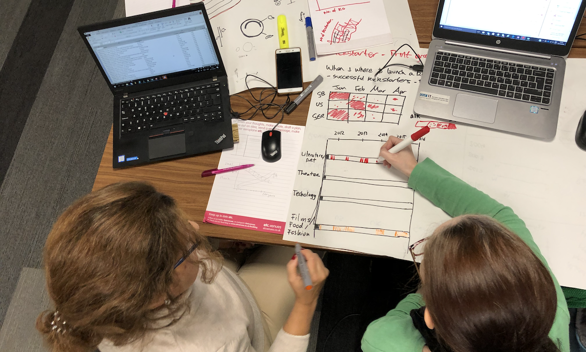
- To provide an opportunity to practice by undertaking focused activities at each stage of the creative workflow, applying and cementing the learning at each stage.
- To inspire you by broadening your visual vocabulary, by exposing you to the latest techniques and contemporary resources, and by giving you the confidence to enhance your data visualisation capabilities.
I currently offer three training types: The Essentials of Data Visualisation, the Fundamentals of Data Visualisation, and the Masterclass in Data Visualisation.
The key characteristic that differentiates these training types is their respective durations. The training is not distinguished by any deliberate stratification of level – basic, intermediate or advanced – it is more defined by the amount of detail one can cover in the time available. The longer the course, inevitably the greater the opportunity to cover the true breadth and depth of the subject in the teaching content as well as the increased scope to incorporate more practical exercises and class activities.
The different types of training are not progressive nor sequential – you don’t complete one then move on to the next. Think of them in terms of being like different sized meals: You wouldn’t order all the meals, you’d pick one or another depending on your appetite for learning, the time you have available, and your budget.
All training is delivered in a technology-agnostic way. The sessions are not structured around technical instruction, point-and-click demos, or tutorials focused on any specific data visualisation package. However, in the longer-form ‘Masterclass’ there is some time allocated to profile the contemporary technology landscape and all training sessions will include shared materials offering references to useful learning resources. This will assist attendees in helping them to find their own specific technical guidance.
Essentials of Data Visualisation
This short-form training offers attendees a crash course about the visual communication of data. The teaching content is organised around several distinct topics that combine to characterise the most critical aspects of data visualisation thinking.
This training is packaged up into 3 hours of contact teaching and short exercise activities, whether for classroom virtual delivery.
The Essentials course would be comparable to a light-bite meal, like a hamburger with a carton of juice – 🍔 🧃.
Fundamentals of Data Visualisation
This training course provides attendees with an understanding about how to effectively and efficiently communicate data visually. The training de-constructs this complex, multi-disciplinary craft in to an organised sequence of topics that build up and combine towards giving attendees thorough appreciation of how to navigate through the many creative, editorial, and analytical options that exist.
This training is packaged up into 6 hours of contact teaching and exercise activities, either structured as a single full-day session for classroom formats or two three-hour sessions for virtual delivery.
The Fundamentals course would be equivalent to a hamburger with fries, a coke and a cookie – 🍔 🍟 🥤 🍪.
Masterclass in Data Visualisation
The long-form Masterclass training provides attendees with a sophisticated understanding of how to communicate data visually in the most impactive way. It is similar in structure to the ‘Fundamentals’ training, but there is double the time and agenda space to go much deeper into the nuances of this subject and to integrate more practical exercises to supplement the learning. The training content imparts knowledge of what to think about, when to think about, and how to resolve all the thinking involved in the contextual, analytical, editorial, and visual decisions that surround all data visualisation challenges.
This training is packaged up into 12 hours of contact teaching, exercise activities and class projects, either structured as two full-day sessions for classroom formats or three four-hour sessions for virtual delivery.
The Masterclass course would be equivalent to a hearty dinner formed of hamburger (with extra bacon) and fries, a side salad, a coke, ice-cream for dessert and then a coffee to finish – 🍔 🥓 🍟 🥗 🥤 🍨 ☕.
TOPIC COMPARISON
- Defining data visualisation, infographics and other related design activities
- Overview of a process-driven approach for efficiency and effectiveness
- The key principles of good data visualisation design
- The role of consuming and creating in sophisticated visualisation literacy
- The influence of contextual requirements and circumstances
- Understanding the ingredients of the 7-hats of visualisation
- Profile of some of the key visualisation tools, applications and libraries
- Overview of useful tutorials using the ‘chartmaker directory’
- A landscape of contemporary techniques and styles of visualisation work
- Assessing the physicality and meaning of your data
- Using visual techniques to explore data
- The components of editorial thinking
- The data visualisation design anatomy
- The building blocks of data encoding
- The spectrum of different chart types and their roles
- The features and role of interactivity in visualisation design
- The role of effective annotation for assistance and insight
- Colour theories and best practice applications
- The architectural considerations for composing a visualisation work
Training FORMATS
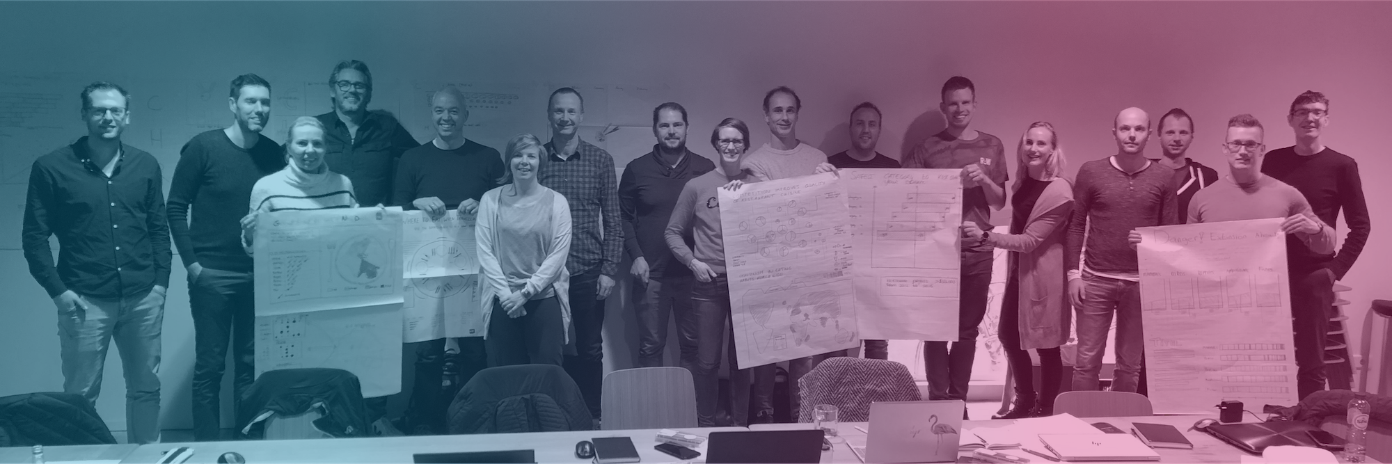
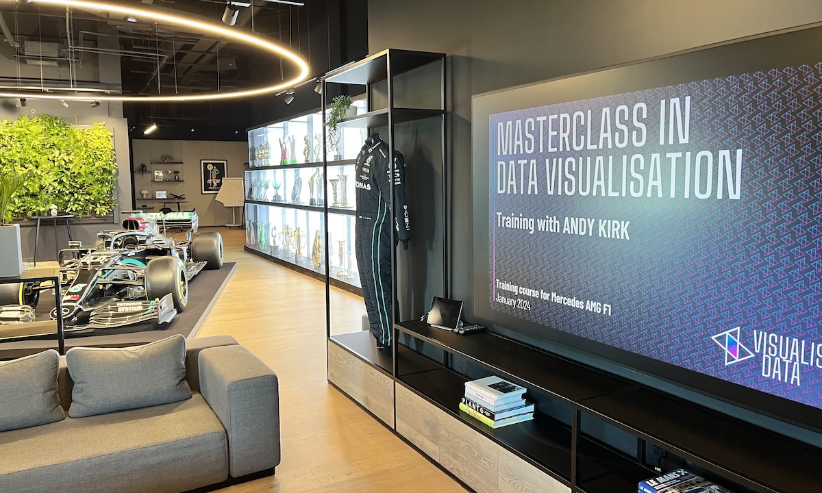
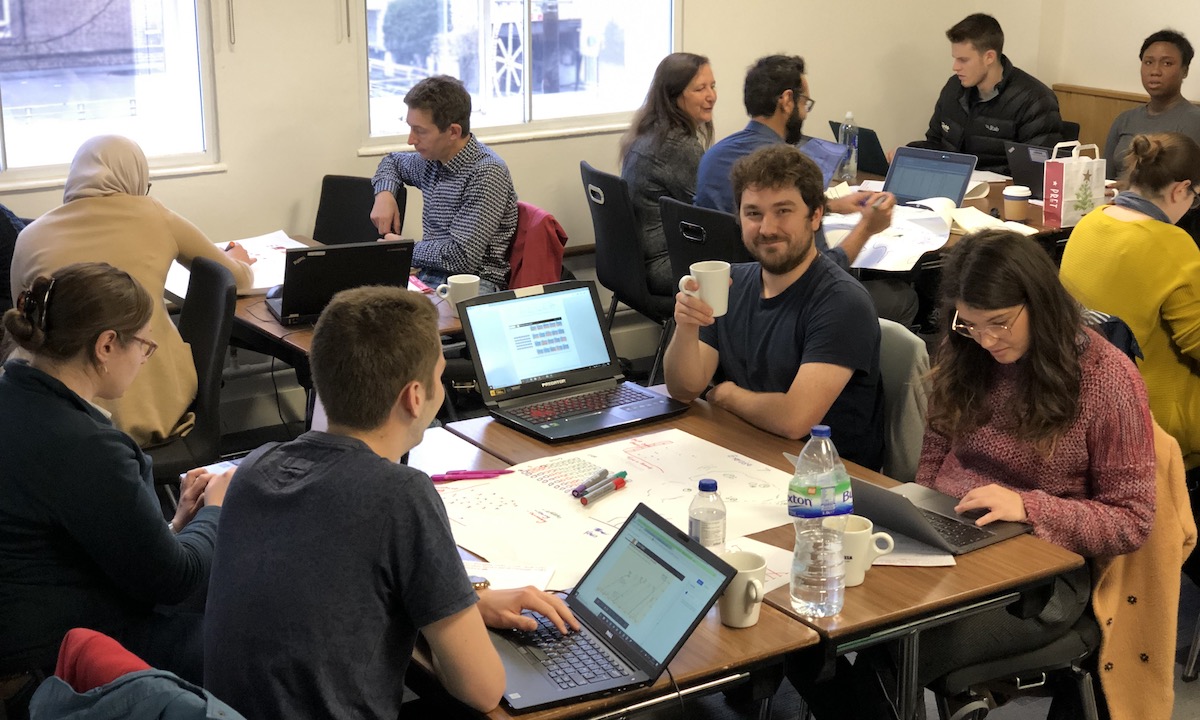
Private training is the most in-demand course event format. Data visualisation training can be delivered remotely or on-site for client organisations in the most convenient corporate locations and at the most convenient times. Clients will be responsible for arranging the venues for such training and also for curating the delegates they wish to invite to attend. If your organisation is interested in hosting a private training event please send me an enquiry email to discuss your requirements. On the home page you can browse through the list of clients I’ve worked with to get a feel for the kind of organisations who have employed my training services.
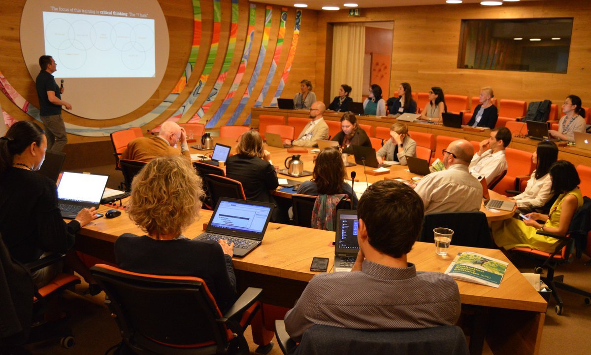
Public courses have been delivered virtually and in public space classrooms all over the world. The locations of classroom-based events are always influenced by the expressed or perceived appetite of people who may be keen for training. If you are interested in attending a public training workshop in a city near you, please email an enquiry to explain your requirements. Public courses are open to and relevant for anybody with an interest in enhancing the sophistication of their visual communications.
Hosted training courses are variations of public courses whereby a third-party organisation hosts and organises a training event, and I just focus on delivering the training rather than organising it. Attendance will usually be open to a managed group of public audience members as determined by the hosts. For example, this may be relevant in situations where a workshop is being offered alongside an associated conference event. If you would like me to deliver a course for your hosted event this usually involves agreeing on a fixed-rate fee in advance or sharing a proportion of revenues generated.
Courses
0
Attendees
0
Countries
0
Days Training
0
Private
0
Public/Hosted
0
Face-to-Face
0
Virtual/Hybrid
0
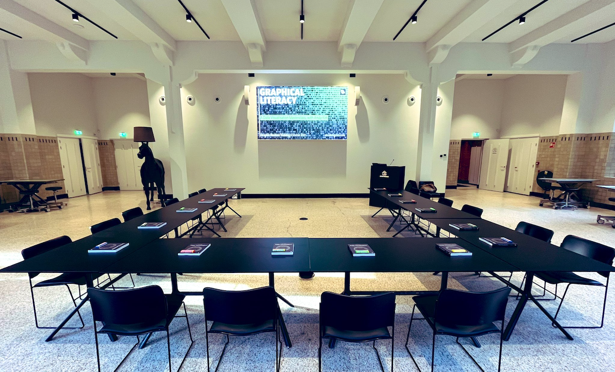
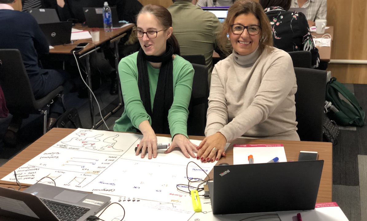
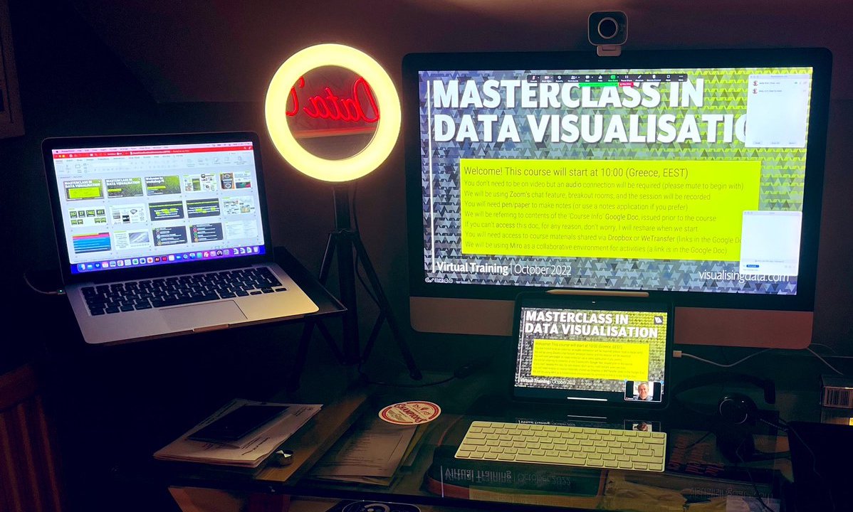
All training courses events, whether private, public, or hosted in nature, are offered in face-to-face classroom format, through entirely virtual online delivery, or via hybrid sessions that are primarily in-person but accommodate remote attendees.
There are different benefits with each: in-person teaching offers a superior setting for personal interactions between delegates and between delegates and the trainer. It is the best environment for injecting and preserving the energy of a session. Learning can be hard, but the necessary efforts of participation can be eased by making sessions fun and well-paced. This is far easier to accomplish when in-person. In public and hosted courses, delegates have the chance to mix with people with different backgrounds, talents and organisational experiences. In private courses there is a team-building dynamic that benefits these occasions.
Teaching virtually is arguably more intense for trainer and learner, having to concentrate on a screen for prolonged periods can be draining. However, with sufficient breaks and reduced overall duration, there is a terrific efficiency that comes with online delivery, enabling people to attend events that otherwise may be obstructed by geographical or availability reasons. Virtual learning aligns well for those people who may prefer to not attend events with groups. Crucially, online delivery facilitates session recording, giving attendees access to videos to recap content they may have missed or failed to grasp at the time.
Currently, online courses are being delivered using Zoom with Microsoft Teams also an option for clients who may be Microsoft-aligned organisations. In all courses, Miro is used as a digital whiteboard for handling and preserving class activities and file-sharing platforms (typically Dropbox, OneDrive, or Google Drive) are used for providing attendees with access to all course materials (slides, exercise files, other resources).
The class sizes for public courses are typically set to an ideal maximum of 16-20 people though a venue’s capacity or delivery platform may dictate slightly more or fewer. For private or hosted events, the client is ultimately invited to decide what size works best for their needs but they are generally recommended to be no smaller than ~8 people and no larger than ~24. The aim is always to optimise the balance between a supportive learning environment with opportunities for one-to-one instruction as well as having sufficient numbers for valuable group interactions and activities.
Who should attend?
These workshops are for anyone looking to develop their competence and confidence with making sense of and communicating data. With over 8250 people having attended these training events since 2011, the spread of characteristics shows they are relevant to people from all backgrounds: all duties, all skills, and all organisation types.
You might be an analyst, statistician, or researcher looking to enhance your data capabilities. Perhaps you’re a skilled designer or developer looking to take your portfolio of work into a more data-driven direction. Maybe you do not personally get involved in the analysis or visualisation of data but coordinate others who do. You might be a frequent consumer of data visualisations looking to increase the sophistication of how you read, interpret and evaluate the effectiveness of such designs.
You might be a manager of a team, considering the opportunity to host a session for the group to learn together, and possibly see it as a chance to sprinkle some team-building fun along the way. Maybe you’re aware of the potentially network of colleagues spread across your organisation but who have similar roles and a shared interest in raising their skills in this space. In arranging a training course you will also see the chance to formulate a community of like-minded practitioners.
These trainings are always intended for anyone and everyone, all audience types and levels are welcome.
But don’t just take my word for it, swipe through these sample testimonials from previous attendees about their experiences…
ENGAGING, EXCITING, INFORMATIVE!Andy is a friendly and excellent teacher who made data visualisation principles accessible and fun, by presenting information in an engaging way and encouraging us to put what we learned into practice. I'm excited to go away and start implementing what I've learned to achieve better data visualisations.
HalimahSoftware Developer Apprentice
STOP! AND PLAN!There were so many takeaways from this fantastic course but my main learning, given the excitement and passion I have around the data I want to share was to take time, stop and plan. Sharing data insights is a process. Andy was great at encouraging careful thought and consideration in the 'how' as well as the 'what' of data visualisation. The biggest lightbulb moment for me was the quote ''Given all you could say, what will you say?" and all of the many considerations for how to say it. The course itself was so involved and practical and has given me frameworks to return to when I'm ready. Unlike other courses I really feel like the material will instantly jog my memory and be 're-accessible' when the time is right. Great course, great book, great training!
Gemma StylesDirector, Higher Education Progression Partnership
INSPIRINGAndy is an expert in this field, and the practical exercises allow you to put the knowledge he gives you into action
StuartPolice Scotland
ENGAGING FAST FUNGood principles to start doing visualisations. I enjoyed the focus on the brief and the critique of what makes a good/bad viz
JaimeData scientist - Police Scotland
COMPREHENSIVE, ENLIGHTENING, ENGAGINGFor me, the strength of Andy's training was to show that Data Viz can be approached methodically, with a sense of process, and that high quality work can be achieved by careful consideration and application of a series of steps. This knowledge, along with the reference materials provided, have given me the tools to move beyond the familiar bar v. pie v. line chart choice.
James WrightAssistant Data Scientist
INSIGHTFUL, WELL-PRESENTED, ENGAGINGThe course put words to thoughts and idea behind visualisation which helped validate some of my thought processes and remove doubt which creeps when i spend a while on the visualisations
Amarpreet KaurData Scientist
FUN INTERACTIVE LEARNINGAlthough it was high level, I took a lot away. I like the classic bar charts and scatterplots, but this has given more scope for presenting data I work with. I am already applying knowledge gained, when I attended a guest lecture a few days later, the presenter was using graphics to convey information and rather than tune out due to the poor use, I was able to analyse critically why I don't like it and how it could be improved. Particularly useful as a group as you can see others thought process on either design choice or critiquing pieces of data viz.
StevenJunior Data Scientist
LOVED EVERY MINUTEAs someone who can sometimes become overwhelmed with the sheer amount of options available when it comes to the world of data visualisation, this course provided an excellent framework for how to approach a task. Each step was broken down into small chunks and there was plenty of interaction and hands on exercises. The course is engaging and encourages all different styles of thinking. I left feeling very inspired and with a wealth of resources to use going forward.
Sarah OatesTechnical Analyst - Police Scotland
BRILLIANTLY ENLIGHTENING Lots of value that has every-day applications and can be shared with the rest of the team
GiuliaRecords Officer
INSIGHTFUL, ENGAGING, EDUCATIONALIt has made me think about how the reader benefits from the visuals I provide. I was also interested in the different tools available that i have not had exposure to before
KatieLead Data Governance Analyst
REALLY INTERESTING STUFFI didn't have much experience of data visualisation coming into this training event, so this has given me lots of ideas and a better understanding of how to present a coherent and engaging story through data. I have already used some of what I have learned to good effect.
JamesJunior Data Scientist
SOLID FOUNDATIONAL COURSEThe course is thoughtfully structured, it cleared a lot of information for me and put the basis for subsequent knowledge
Victor IonichiFreelance Motion Designer
CREATIVE, INSPIRED, STRUCTUREDAndy Kirk’s training was invaluable for mastering data visualization. The interactive format and practical insights make it a must for anyone looking to improve their data communication skills.
DenysPower BI Developer
AN OUTSTANDING EXPERIENCEI learnt about the end to end data visualization experience and learnt how different chart types can be used in different situations / circumstances. All the elements that make up a data visualisation were thoroughly explained and my understanding about this subject has improved over the duration of the course.
Abu Bakar Nisar AlviPower BI Consultant and Trainer
DETAILED INTERESTING INTERACTIVE
Wide topic breadth covering both theory and practical applications, it got the creative juices flowing with provided plenty of resources to follow up with.
Wide topic breadth covering both theory and practical applications, it got the creative juices flowing with provided plenty of resources to follow up with.
Thomas GateData Analyst, YAGRO
INTERESTING, ENGAGING, USEFUL
It really helped me think more visually and more creatively about data.
It really helped me think more visually and more creatively about data.
Anna BucksSeries Producer, The Economist
A GREAT EXPERIENCE
Very engaging. I appreciate Andy's charismatic style of running the 2 day training.
Very engaging. I appreciate Andy's charismatic style of running the 2 day training.
Philip KwapongSenior Presentation Designer
THOUGHT-PROVOKING, ENGAGING, INSPIRING
A solid framework to think about in the creative process of designing data visualisations. Inspired by examples shown and discussions had within the group.
A solid framework to think about in the creative process of designing data visualisations. Inspired by examples shown and discussions had within the group.
Ed HorReporting Analyst, Specsavers
INSIGHTFUL AND INSPIRING
Really enjoyable and well-paced deep dive into the designing process of creating impactful visualisations.
Really enjoyable and well-paced deep dive into the designing process of creating impactful visualisations.
Nathan GroombridgePerformance Analyst at Avanti West Coast
INSIGHTFUL, INTERACTIVE, INTERESTING
Great to see how others think and work and absorb some of Andy's experience.
Great to see how others think and work and absorb some of Andy's experience.
AILSA WILSONAirport Capacity Manager, Edinburgh Airport
INSIGHTFUL AND ENLIGHTENINGA great couple of days exploring Andy's take on all things Data Viz. With an emphasis on the critical thinking behind visualising data, we were guided through the process with interesting, thought provoking activities and Andy ensured that it was relaxed and fun.
CHRIS KNIGHTData Visualisation Developer
INSPIRING TOP COURSEThis training will make you think differently about the process and visualization itself.
WILFRED KLUINConsultant
INSPIRING CREATIVE CHALLENGEThis course challenged me creatively, inspired me to continue evolving the way I work and provided a comprehensive overview of best practice in the field of dataviz.
BEN WYLIEData journalist
HIGHLY RECOMMENDED
Great mix of teaching, supporting materials and interactive exercises. I feel much more confident in being able to analyse data and come up with my own visualisations after taking this workshop.
Great mix of teaching, supporting materials and interactive exercises. I feel much more confident in being able to analyse data and come up with my own visualisations after taking this workshop.
Michelle BarkerFront End Developer, Ada Mode
VERY INSIGHTFUL
This event gave a great insight into the many different ways to present data, and really helped me to think about how I can improve the presentation of my own work going forward so that it is more useful for our clients.
This event gave a great insight into the many different ways to present data, and really helped me to think about how I can improve the presentation of my own work going forward so that it is more useful for our clients.
Harry GoozeeAnalytics Consultant
AMAZING EDUCATIONAL UNFORGETTABLE!
Andy Kirk is a charismatic trainer. The Masterclass in Data Visualisation excited me so much, that although I am a shy person working in teams/workshops, I could easily continue to interact with the trainer and my classmates for days! It surely broadened my horizons in creatively representing data. It is a unique experience, I recommend it to all!
Andy Kirk is a charismatic trainer. The Masterclass in Data Visualisation excited me so much, that although I am a shy person working in teams/workshops, I could easily continue to interact with the trainer and my classmates for days! It surely broadened my horizons in creatively representing data. It is a unique experience, I recommend it to all!
Aristidis LebesisSenior Business Intelligence Engineer (OTE S.A.)
DATA VIZ HEAVEN!
Really loved the course, really helped to give me more tools to be better at my job. The discussions around thought processes on how to develop your visuals was very beneficial. The interaction tools that were used in the course really made me feel part of a group and not a solo person at the other end of a laptop, was a big help to see other peoples work in real time. So much to recommend from this course, well everything really.
Really loved the course, really helped to give me more tools to be better at my job. The discussions around thought processes on how to develop your visuals was very beneficial. The interaction tools that were used in the course really made me feel part of a group and not a solo person at the other end of a laptop, was a big help to see other peoples work in real time. So much to recommend from this course, well everything really.
David JohnstonPower BI Developer
INSPIRING AND ENLIGHTENING
Great overview with insightful tips, Andy knows his stuff and manages to convey it with passion. The highlight for me was the critical thinking and the way of challenging all preconceived ideas. Left me with a new view of data viz and a willingness to apply this new way of thinking as much as possible.
Great overview with insightful tips, Andy knows his stuff and manages to convey it with passion. The highlight for me was the critical thinking and the way of challenging all preconceived ideas. Left me with a new view of data viz and a willingness to apply this new way of thinking as much as possible.
Emilie SingerData Science Specialist (Etat de Vaud, Switzerland)
ESSENTIAL FUNDAMENTALS
This class taught me how to create better visualizations by explaining the core principles and means of visualization.
This class taught me how to create better visualizations by explaining the core principles and means of visualization.
Joe ZaherTechnical Account Manager
REWARDING OVER EXPECTATIONS
Andy does a remarkable job of bringing a ton of knowledge and experiences to the table in a smooth and elegant way. Everything is super organized and aligned under clear and robust concepts. From the very beginning of the course, I testified it's a vision established through years of practice and reflection, which brought me not just insight into my Data Visualisation routines but also new skills. I highly recommend attending this Masterclass if you want to take the next step in your abilities.
Andy does a remarkable job of bringing a ton of knowledge and experiences to the table in a smooth and elegant way. Everything is super organized and aligned under clear and robust concepts. From the very beginning of the course, I testified it's a vision established through years of practice and reflection, which brought me not just insight into my Data Visualisation routines but also new skills. I highly recommend attending this Masterclass if you want to take the next step in your abilities.
Jorge VerlindoProduct Designer
FANTASTIC, THOUGHT-PROVOKING, ENJOYABLE
Andy gives a great outline of his process and the things that need to be considered to produce outstanding visuals, his examples are well thought out and he clearly has his eyes on the ball.
Andy gives a great outline of his process and the things that need to be considered to produce outstanding visuals, his examples are well thought out and he clearly has his eyes on the ball.
Mark EndicottLead Analyst
CLEAR INSIGHTFUL ENGAGING
Really enjoyed my time, sessions were interactive!
Really enjoyed my time, sessions were interactive!
Abdal AhmedPerformance and Intelligence Analyst
VISUALISATION DESIGN THINKING
As an experienced data visualisation professional working within product management, I wanted to re-immerse myself in data viz. I yielded many new ideas and techniques from Andy's course and learned what others wanted to create without being limited by technology or data quality. When asking about this course, Andy shared with me that this advanced training would fit any skill level, I completely agree. I also attended the course with 2 colleagues, working in development and design who loved the training.
As an experienced data visualisation professional working within product management, I wanted to re-immerse myself in data viz. I yielded many new ideas and techniques from Andy's course and learned what others wanted to create without being limited by technology or data quality. When asking about this course, Andy shared with me that this advanced training would fit any skill level, I completely agree. I also attended the course with 2 colleagues, working in development and design who loved the training.
Piers BatchelorProduct Manager
ENGAGING AND PRACTICAL
The course was well-paced, gradually building up a grammar of good practice that we could absorb and implement. It was also really well structured, with clear and engaging teaching broken up by interactive sessions. The two days flew by: good fun and immensely valuable.
The course was well-paced, gradually building up a grammar of good practice that we could absorb and implement. It was also really well structured, with clear and engaging teaching broken up by interactive sessions. The two days flew by: good fun and immensely valuable.
Jenny CollinsDatabase Marketing and Reporting Manager, Age UK
VERY WELL PRESENTED
Whether you're new to Data Viz or have been working with it for a bit, this course covers a lot of the fundamental thinking and elements of good Data Viz that is valuable at any level. I especially benefitted from the section on Chart Types.
Whether you're new to Data Viz or have been working with it for a bit, this course covers a lot of the fundamental thinking and elements of good Data Viz that is valuable at any level. I especially benefitted from the section on Chart Types.
Sam ElbouezSenior Designer, Data Visualization (Morning Consult)
BRILLIANT DEEP DIVE!
The four day session with Andy was an excellent deep dive into data visualisation for all abilities. There was a perfect balance of interactive and lecture based teaching and everything was brilliantly explained. I would definitely recommend this course!
The four day session with Andy was an excellent deep dive into data visualisation for all abilities. There was a perfect balance of interactive and lecture based teaching and everything was brilliantly explained. I would definitely recommend this course!
Jackie MathurCancer Data and Impact Officer, Yorkshire Cancer Research
THOUGHT PROVOKING, NUANCED
Good intro to dataviz theory, whilst giving a wide option of levels for participants to come in at and still come away with useful learning
Good intro to dataviz theory, whilst giving a wide option of levels for participants to come in at and still come away with useful learning
DavidSupply Chain Analyst, Edrington
THOUGHTFUL VIZPERATION!
Does a great job helping you think about all parts of the data viz process and being intentional at each step along the way.
Does a great job helping you think about all parts of the data viz process and being intentional at each step along the way.
Clark ThompsonFootball Insights Analyst - NYCFC
ENLIGHTENING EXPERIENCE
This training introduced the data viz in very clear, logical, and structured manner. It kind of a structured all the knowledge I had, and completed the empty spaces. I feel much more at ease in taking data viz decisions, and the decisions taking process. I highly recommend it!
This training introduced the data viz in very clear, logical, and structured manner. It kind of a structured all the knowledge I had, and completed the empty spaces. I feel much more at ease in taking data viz decisions, and the decisions taking process. I highly recommend it!
KamilaUX designer (investment banking)
HIGHLY INFORMATIVE
The key take away for me from this course was learning how to structure any data visualization project effectively using a step-by-step design process. It was highly engaging and informative.
The key take away for me from this course was learning how to structure any data visualization project effectively using a step-by-step design process. It was highly engaging and informative.
Hind FrancisIndependent Researcher
INSIGHTFUL AND INSPIRING
A very comprehensive tour through many aspects of data visualisation, providing many widely applicable concepts, approaches and ideas.
A very comprehensive tour through many aspects of data visualisation, providing many widely applicable concepts, approaches and ideas.
Flooh PerlotPolitical Scientist (Institute for Strategic Analysis, Vienna)
INSPIRING, CHALLENGING, ORGANIZED
Andy is a brilliant trainer and I am impressed by his ability to organize the knowledge about the data visualisation. I am inspired by multiple visualisations that have been shown and evaluated during workshops. It was a challenging training that advanced my design process understanding.
Andy is a brilliant trainer and I am impressed by his ability to organize the knowledge about the data visualisation. I am inspired by multiple visualisations that have been shown and evaluated during workshops. It was a challenging training that advanced my design process understanding.
Monika MajewskaLead Operations Business Analyst
STRUCTURE AND INSPIRATION
Inspiration on new ways to visualize data, more structure when thinking about data visualization
Inspiration on new ways to visualize data, more structure when thinking about data visualization
Bertram PammingerHead of an IT team, Daimler Truck
INFORMATIVE, INSPIRING, CHALLENGING
Shakes up your thinking, makes you dive deeper and questions assumptions.
Shakes up your thinking, makes you dive deeper and questions assumptions.
Kate JarvisDesigner
LEFT WANTING MORE!
Before Andy's course I've never been too attracted to data visualisation, but now I can't get enough of it! This course is perfect for any expertise level or profession. Really so impressed with how much I learnt in two days!
Before Andy's course I've never been too attracted to data visualisation, but now I can't get enough of it! This course is perfect for any expertise level or profession. Really so impressed with how much I learnt in two days!
Warren AspelingLead Digital Designer, Portland PR
INTERESTING AND INFORMATIVE
Have more knowledge to allow myself to show data in a more interesting and insightful way, to help councillors and colleagues in the decision making process for the good of the district.
Have more knowledge to allow myself to show data in a more interesting and insightful way, to help councillors and colleagues in the decision making process for the good of the district.
Simon PurfieldPerformance, Consultation & Insight Manager, Stratford-on-Avon District Council
INFORMATIVE AND FUN!
I gained new insights for how to use data visualization as a tool in my qualitative research. The structure of the workshop was excellent - I really enjoyed the mix of lecturing and group exercises that put that knowledge to practice.
I gained new insights for how to use data visualization as a tool in my qualitative research. The structure of the workshop was excellent - I really enjoyed the mix of lecturing and group exercises that put that knowledge to practice.
Robin SteedmanPostdoctoral researcher
INFORMATIVE COMPREHENSIVE INTERESTING
I work for a data and analytics company and it was interesting to hear about all the sorts of visualisations. Found it really interesting to listen to (and a bit hard to put into practice)
I work for a data and analytics company and it was interesting to hear about all the sorts of visualisations. Found it really interesting to listen to (and a bit hard to put into practice)
MarysiaUX designer at RBI
CAPTIVATING, INTERACTIVE AND VISUAL.
From start to finish the event told a story. I learnt firstly to establish the curiosity of a piece of information and that there is far more to data visualisation than it's aesthetic appeal. Sometimes too much really is too much!
From start to finish the event told a story. I learnt firstly to establish the curiosity of a piece of information and that there is far more to data visualisation than it's aesthetic appeal. Sometimes too much really is too much!
Laura LuckingClient Service Co-ordinator
ENGAGING AND CHALLENGING
This course was very easy to follow and really challenged some pre-conceived ideas I had. It was good to have such an engaging course leader who really cares about the subject. It was also a great intro to what visualisation tools are out there which you don't always get time to research in the busy day-to-day of working in the NHS
This course was very easy to follow and really challenged some pre-conceived ideas I had. It was good to have such an engaging course leader who really cares about the subject. It was also a great intro to what visualisation tools are out there which you don't always get time to research in the busy day-to-day of working in the NHS
Laura CorbettPrincipal Information Analyst, NHS Digital
VERY VERY GOOD
Really inspiring event.
Really inspiring event.
Tom ClarkeSystems Specialist
DETAILS MATTER
Nice explanation on how to build a visual in different steps - good mix of theory and practise
Nice explanation on how to build a visual in different steps - good mix of theory and practise
Bruno De KneefBusiness Analyst - Data & Analytics
INFORMATIVE, CRITICAL AND FUN
The ability to apply editorial aspects to data vis will help develop my skills for years to come.
The ability to apply editorial aspects to data vis will help develop my skills for years to come.
Scott BellData Scientist
EYES&BRAIN OPENED WIDE
Fantastic dive into the critical thinking, skills and techniques required to create engaging, impactful, and informative data visualisations.
Fantastic dive into the critical thinking, skills and techniques required to create engaging, impactful, and informative data visualisations.
Rhona MacLennanEnterprise Information Architect
THOUGHT-PROVOKING
The course really allowed me to re-think how we deliver our current data to customers and how this can be improved on. I left with a new confidence to try new/different visuals for the data I use on a daily basis.
The course really allowed me to re-think how we deliver our current data to customers and how this can be improved on. I left with a new confidence to try new/different visuals for the data I use on a daily basis.
Lucy TiffanyLead Business Information Analyst, Pennine Care NHS Foundation Trust
FANTASTIC
Lots and lots of good concepts we can integrate in out daily work. Very helpful indeed!
Lots and lots of good concepts we can integrate in out daily work. Very helpful indeed!
GregProject Manager
VERY WELL STRUCTURED
I will now be more efficient at planning, managing and designing visualisations.
I will now be more efficient at planning, managing and designing visualisations.
Kyle HooperData and Analytics Graduate (Dyson)
INFORMATIVE AND THOUGHT-PROVOKING
Andy knows his stuff, and the workshop provided lots of opportunity to think about the process underpinning data visualisation, and a toolkit of resources to help me pick my tools and charts wisely depending on the task in hand.
Andy knows his stuff, and the workshop provided lots of opportunity to think about the process underpinning data visualisation, and a toolkit of resources to help me pick my tools and charts wisely depending on the task in hand.
Helen CooperDirector
FILLED (IN) THE GAPS
The event filled in the gaps for me. As a designer/developer I have the skills to build data visualisations, but I always wanted a better understanding of why. Which charts to use, why and when. The benefits depending of the type of data and the message/story from the data that you are communicating to the viewer. All these questions were answered through informative explanations, discussion and hands on tasks. Cheers Andy!
The event filled in the gaps for me. As a designer/developer I have the skills to build data visualisations, but I always wanted a better understanding of why. Which charts to use, why and when. The benefits depending of the type of data and the message/story from the data that you are communicating to the viewer. All these questions were answered through informative explanations, discussion and hands on tasks. Cheers Andy!
Corey BensonDigital Designer/Developer (Freelance)
INFORMATIVE, INTERACTIVE, (I)NJOYABLE*
Thoroughly enjoyable and informative course that challenges the way you approach and think about data visualisations. Would definitely recommend for anyone whose role involves the design or ownership of data visualisations.
Thoroughly enjoyable and informative course that challenges the way you approach and think about data visualisations. Would definitely recommend for anyone whose role involves the design or ownership of data visualisations.
Steven TranBI Analyst, ZPG
LOTS OF VALUE
Great coverage and immediately useful stuff. It is from the very beginning that Andy has a deep and broad knowledge of his subject.
Great coverage and immediately useful stuff. It is from the very beginning that Andy has a deep and broad knowledge of his subject.
Claire AgnewExperience Designer
AWESOME FULL PROFESSIONALISM
I got to refresh my thinking about data visualisation totally. Andy truly shares his knowledge.
I got to refresh my thinking about data visualisation totally. Andy truly shares his knowledge.
Niina KalliainenVisual specialist
THANK YOU!
The workshop is focused on a way of thinking, which makes it valuable also for us who do not work with Excel spreadsheets but still want to use visualisation to get our message across. I loved the exercises that were spread across the day, they really got your brain going and spawned eager talks with fellow workshoppers. Extra points for amazingly smooth delivery and dry humour.
The workshop is focused on a way of thinking, which makes it valuable also for us who do not work with Excel spreadsheets but still want to use visualisation to get our message across. I loved the exercises that were spread across the day, they really got your brain going and spawned eager talks with fellow workshoppers. Extra points for amazingly smooth delivery and dry humour.
Marja OllilaTranslator and editor
INTERESTING CLEAR NECESSARY
I use on daily basis graphics to show information to various audience. This course was a very nice summary on techniques to use to be able to go (like with words) straight to the point. (a graphic is better than a long speech). To talk and to summarize a complex situtation with an easier and understanding graphic.
I use on daily basis graphics to show information to various audience. This course was a very nice summary on techniques to use to be able to go (like with words) straight to the point. (a graphic is better than a long speech). To talk and to summarize a complex situtation with an easier and understanding graphic.
Nahoé YvesFinancial Analyst
THINK MEANINGFULLY
Makes you more subjective of every aspect of the data you present, and data presented to you. Often less is more.
Makes you more subjective of every aspect of the data you present, and data presented to you. Often less is more.
DanAnalyst
IT'S A RECIPE!
I got instructions for making a meal out of the ingredients. Before I more or less just tried to select appropriate chart types but now I will reserve more time for the thought processes that come before even diving in with the data. Also, there are apparently a lot of decisions I have made without even realising. Every decision I make I have to be able to explain. In short, I got more awareness for the cooking 🙂
I got instructions for making a meal out of the ingredients. Before I more or less just tried to select appropriate chart types but now I will reserve more time for the thought processes that come before even diving in with the data. Also, there are apparently a lot of decisions I have made without even realising. Every decision I make I have to be able to explain. In short, I got more awareness for the cooking 🙂
Hanna KumpulaProject engineer (Data designer)
ENLIGTHENING, ENGAGING & EFFECTIVE
I got much clarity and increased awareness about the number of choices I have to make to communicate effectively and guidance on how to think. All in an engaging and effective package of two days. As I return to work I have a couple of drafts and new ideas that I plan to complete very soon. I have also increased my vocabulary with terms such as ‘dendrogram’ and ‘sankey diagram’, which surely must come in handy sometime!
I got much clarity and increased awareness about the number of choices I have to make to communicate effectively and guidance on how to think. All in an engaging and effective package of two days. As I return to work I have a couple of drafts and new ideas that I plan to complete very soon. I have also increased my vocabulary with terms such as ‘dendrogram’ and ‘sankey diagram’, which surely must come in handy sometime!
Olivia SetkicPolicy Specialist
INSIGHTFUL VISUALIZATION TRAINING
Good overview of what works and what does not, what to pay attention to and what are the tools available.
Good overview of what works and what does not, what to pay attention to and what are the tools available.
MarjuBusiness analyst
DIDACTIC AND INSIGHTFUL
Lots of examples and tools to build effective and understable graphs, tables, ... and make your message more impactful
Lots of examples and tools to build effective and understable graphs, tables, ... and make your message more impactful
AlexisFinancial Business Analyst, SWIFT
INSIGHTFUL AND INFORMATIVE
Was good to be in a room with lots of smart people. I found all of the activities and tasks engaging.
Was good to be in a room with lots of smart people. I found all of the activities and tasks engaging.
Paul LargeOperations and Systems Specialist, BDA Partners
EYE-CATCHING INSIGHTS
Very useful insights on how to optimally focus the eyes of your audience on the data you present
Very useful insights on how to optimally focus the eyes of your audience on the data you present
Etienne GILBERTData Governance Lead
INCREDIBLE LEARNING EXPERIENCE
An amazing theoretical and practical workshop held by a talented and knowledgable designer working within the industry. I went in with a little bit of knowledge of the subject beforehand and gained a much deeper insight I can take forward into my role. This two-day workshop is brilliant for people of all levels!
An amazing theoretical and practical workshop held by a talented and knowledgable designer working within the industry. I went in with a little bit of knowledge of the subject beforehand and gained a much deeper insight I can take forward into my role. This two-day workshop is brilliant for people of all levels!
Rehan AbdulInformation Designer
FRIENDLY COMPREHENSIVE OVERVIEW
I used this event to test my current knowledge against the contents of the course to see where I stand in the level. Also, it was useful to get in contact with other people in the field. As I work rather alone, it was stimulating to come in contact with like-minded people. I would recommend, not only for the contents being absolutely a must to know, but also for the comfortability of being teached in a down-to -Earth matter-of fact way.
I used this event to test my current knowledge against the contents of the course to see where I stand in the level. Also, it was useful to get in contact with other people in the field. As I work rather alone, it was stimulating to come in contact with like-minded people. I would recommend, not only for the contents being absolutely a must to know, but also for the comfortability of being teached in a down-to -Earth matter-of fact way.
Nuria AltimirResearch Coordinator/visualizer, University of Helsinki
RELEVANT AND PUNCHY
A thoughtfully constructed session delivering concrete examples of good practice for Data Visualisation techniques.
A thoughtfully constructed session delivering concrete examples of good practice for Data Visualisation techniques.
Jo McSweeneyHigher Information Analyst
FANTASTIC INSIGHTFUL COURSE
Great background on best practice but also tools and resources suggested that we will use/look into using in the future.
Great background on best practice but also tools and resources suggested that we will use/look into using in the future.
Roseanna Kennedy-SmithSenior Public Health intelligence specialist, London Borough of Enfield
GOOD TO GREAT
For anyone who is starting, or already on their way to master data visualizations and up their game, this workshop is for you. There were a number of “gems” presented, but what really hit home was the point centered on that as unique and valuable the data we use, see, and generate is precious and often one of kind. However, how we visualize is not. To think, and focus more on visualization as a process, versus jumping right to developing in whatever the tool of choice is. This is woven throughout the workshop with exercises, activities, thought leadership, and inspirational visualizations to drive key points home, and cement learnings. Andy’s thought leadership here gave me the confidence to shift further my own perspective from tangible outcomes to a more abstract all-encompassing process. The result has my own professional growth and craft more effective data stories and communication of insight. Big thank you to Andy and highly recommend it to all those who are interested in data visualizations.
For anyone who is starting, or already on their way to master data visualizations and up their game, this workshop is for you. There were a number of “gems” presented, but what really hit home was the point centered on that as unique and valuable the data we use, see, and generate is precious and often one of kind. However, how we visualize is not. To think, and focus more on visualization as a process, versus jumping right to developing in whatever the tool of choice is. This is woven throughout the workshop with exercises, activities, thought leadership, and inspirational visualizations to drive key points home, and cement learnings. Andy’s thought leadership here gave me the confidence to shift further my own perspective from tangible outcomes to a more abstract all-encompassing process. The result has my own professional growth and craft more effective data stories and communication of insight. Big thank you to Andy and highly recommend it to all those who are interested in data visualizations.
Christopher HayesSenior Manager, Business Analytics
NEW BEGINNINGS IN DATAVIZ
Andy Kirk has a wealth of experience in data visualization. It was an honor to attend his class. His class has given me a framework to approach all my data visualization projects in the future.
Andy Kirk has a wealth of experience in data visualization. It was an honor to attend his class. His class has given me a framework to approach all my data visualization projects in the future.
Baricha S. Ali AbdiEx - KPMG now DataViz freelancer
BEST COURSE EVER
Covered all from foundations to more advanced topics. Rich full of content yet easy to follow. Incl. exercises and your own miniproject to present at the end. Andy Kirk is truly a brilliant expert who knows how to engage his audience of different professions. In short - the best course I've ever attended.
Covered all from foundations to more advanced topics. Rich full of content yet easy to follow. Incl. exercises and your own miniproject to present at the end. Andy Kirk is truly a brilliant expert who knows how to engage his audience of different professions. In short - the best course I've ever attended.
Miłosz NiedzielaStaffing Manager, Bombardier
INSIGHTFUL!
This training gave me invaluable tools to structure my critical thinking and my data visualizations creation process. The content is quite practical while providing a more profound understanding of what makes a good visualization. It will significantly support my decision making in the future. Highly recommended!
This training gave me invaluable tools to structure my critical thinking and my data visualizations creation process. The content is quite practical while providing a more profound understanding of what makes a good visualization. It will significantly support my decision making in the future. Highly recommended!
Anne-Marie DufourIndependent Data Visualization Designer & Developer
AWESOME, ENLIGHTENING AND MOTIVATING
This course is perfect to review or learn the best visuals practices and learn a method to deliver top-class visuals. I will highly recommend this course inside my company and in my network.
This course is perfect to review or learn the best visuals practices and learn a method to deliver top-class visuals. I will highly recommend this course inside my company and in my network.
Annabelle RinconTableau Center of Enablement Lead
