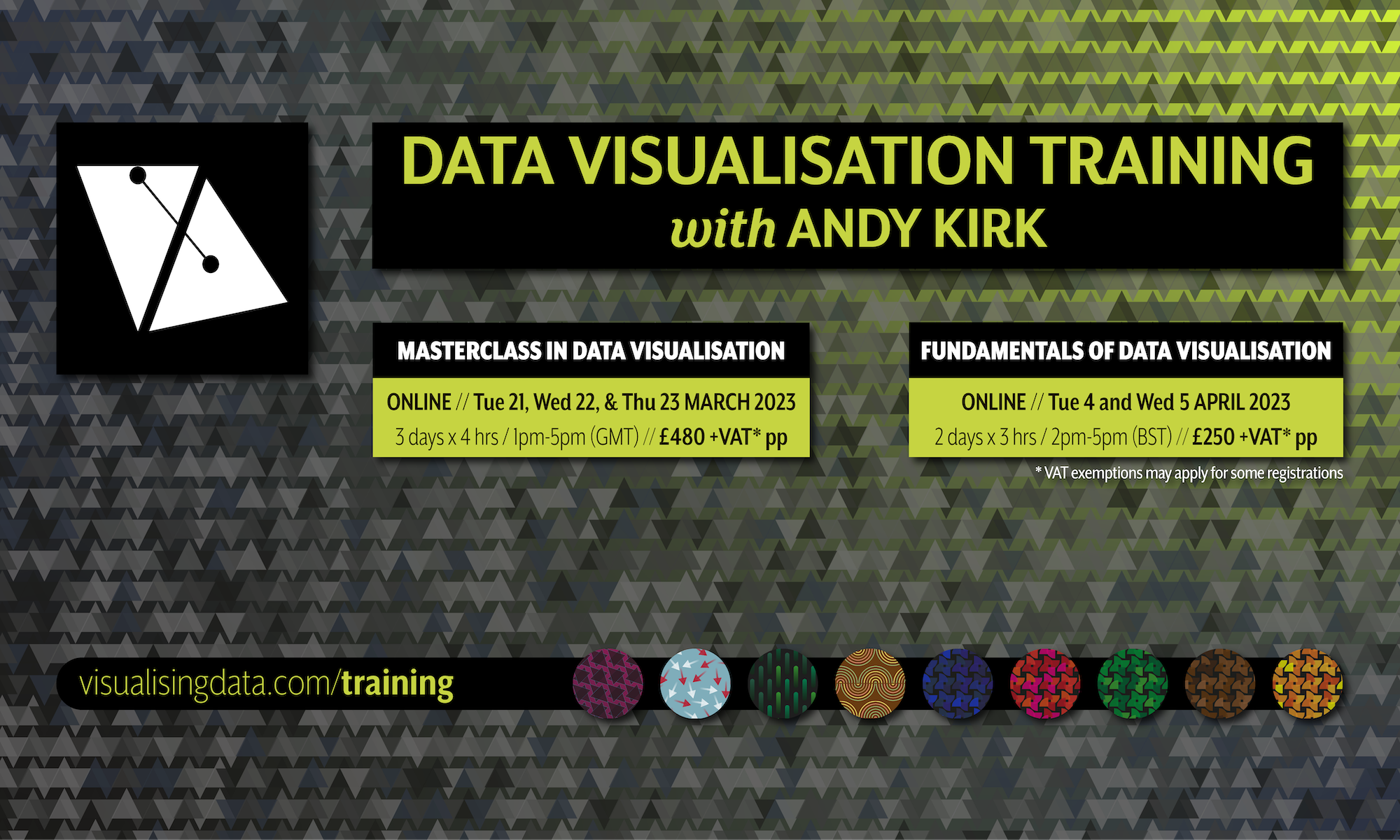
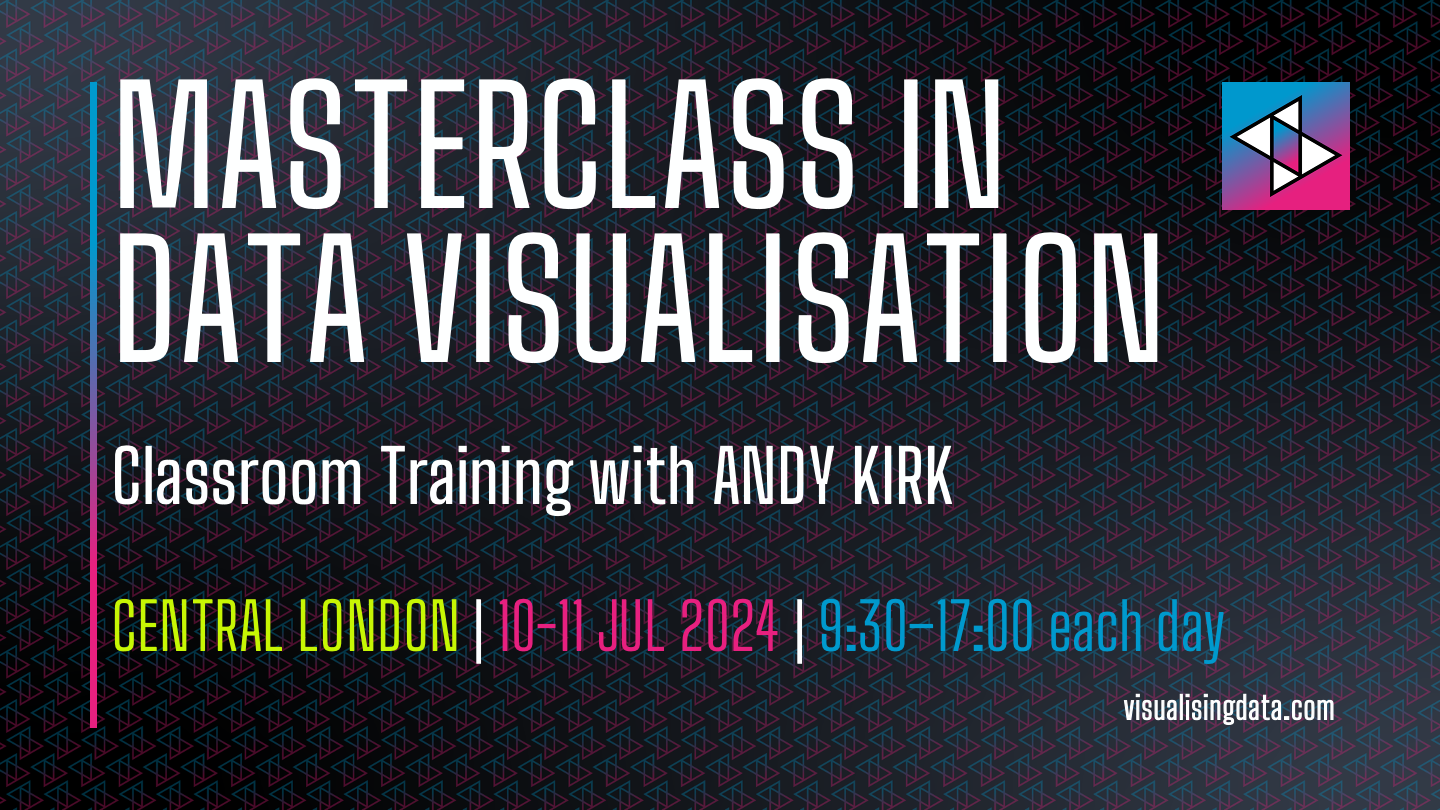
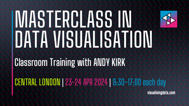
New Course: ‘Masterclass in Data Visualisation’ (London, Jul 2024)
I’m happy to announce details of a new public training course, the two-day classroom based ‘Masterclass in Data Visualisation’ will take place in London, on 10-11 July 2024.
Visualisingdata.com was originally launched in 2010 originally to serve as a blog to help continue the momentum of my learning from studying the subject via a Masters degree. I continue to publish articles and share announcements that track developments in my professional experiences as well as developments in the data visualisation field at large.
This is a collection of all my published posts, starting with the newest and dating back to 2010, tracking. These posts include articles, design commentaries, podcast updates, professional updates, and general news from across the data visualisation field.
I’m happy to announce details of a new public training course, the two-day classroom based ‘Masterclass in Data Visualisation’ will take place in London, on 10-11 July 2024.
I’m happy to announce details of a new public training course, the two-day classroom based ‘Masterclass in Data Visualisation’ will take place in London, on 23-24 April 2024.
I’ve decided to compile an updated profile of where you will find me across the web’s places and platforms and the nature and extent to which I will be active with each.
Welcome to S4E9 of Explore Explain, a long-form video and podcast series about data visualisation design. In this episode I chat with Chloe Whiteaker and Marie Patino of Bloomberg News. We explore the story behind their unique data visualisation project analysing the staggering wealth of a pop-music phenomenon: “Taylor Swift Vaults Into Billionaire Ranks with Blockbuster Eras Tour”.
I’m very happy to announce details of a newsletter that I will be launching in February. The Visualising Data Newsletter will chronicle the most insightful and delightful data visualisation content every month, sent straight to your inbox.
Welcome to S4E8 of Explore Explain, a long-form video and podcast series about data visualisation design. In this episode I chat with Denise Lu about her side project visualising analysis of the tracks played during the reunion shows of her favourite band: this is ‘Pavement 1933-2023’.
2023 has seen an explosion in the buzz of new developments and discourse surrounding all things to do with Artificial Intelligence. In this series of posts I’m taking stock of what I know, what I don’t know, what I think, and what I might speculate about what these advancements in AI mean in its applicability for data visualisation.
Welcome to S4E7 of Explore Explain, a long-form video and podcast series about data visualisation design. In this episode I chat with Amanda Shendruk about her visual article for Washington Post Opinions titled ‘Audiences want a different climate change message. Hollywood should deliver.’
2023 has seen an explosion in the buzz of new developments and discourse surrounding all things to do with Artificial Intelligence. In this series of posts I’m taking stock of what I know, what I don’t know, what I think, and what I might speculate about what these advancements in AI mean in its applicability for data visualisation.
I’m happy to share news that I’m working on the next edition of my book ‘Data Visualisation: A Handbook for Data Driven Design’.
Welcome to S4E6 of Explore Explain, a long-form video and podcast series about data visualisation design. In this episode I chat with Chimdi Nwosu about two of his data visualisation projects: ‘Incarcerated in America’ and ‘Press Freedom Index’.
Happy to share news of the release of a new batch of Explore Explain shorter ‘highlights’ videos for Season 4. The idea is to identify, extract, edit, and package up five key insights to emerge from each episode to create short 10-15 mins highlights.
I’m happy to announce details of a new public training course, the two half-day virtual ‘Fundamentals of Data Visualisation’ will take place online on 10-11 January 2024, 2pm to 5pm (UK) each day.
Happy to share news of the release of the first batch of Explore Explain shorter ‘highlights’ videos for Season 3. The idea is to identify, extract, edit, and package up five key insights to emerge from each episode to create short 10-15 mins highlights.
I’m happy to announce details of a new public training course, the two-day classroom based ‘Masterclass in Data Visualisation’ will take place in London, on 21-22 February 2024.
This is a call for potential industry partners and/or collaborators to learn more about an exciting research opportunity, to register their interest, and, hopefully, to ultimately commit to participating
Welcome to S4E5 of Explore Explain, a long-form video and podcast series about data visualisation design. In this episode I chat with Lora Oehlberg and Samuel Huron about their work on a new book titled ‘Making with Data’
This is a published version of my experimental play with my new Threads account in which I chronicle a single working day to give some brief insight into life as a data vis freelancer.
In this post I share several sections of useful resources that may help you find out what data visualisation tools are available, are being used, and what they are capable of in terms of charting features.
Welcome to S4E4 of Explore Explain, a long-form video and podcast series about data visualisation design. In this special live-recorded episode I chat with the Nightingale Editorial Team: Claire Santoro, Emily Barone, Julie Brunet, and Jason Forrest.
Welcome to S4E3 of Explore Explain, a long-form video and podcast series about data visualisation design. In this episode I chat with Steph Bradley, a freelance designer based in Chicago, USA.
Next month, at Outlier Conference in Porto, I’m doing a live-recorded episode with the team behind the Nightingale print magazine and I’d like to collect any thoughts or questions you might have about this new publication!
Welcome to S4E2 of Explore Explain, a long-form video and podcast series about data visualisation design. In this episode I chat with Will Chase, Visual Stories Editor, and Jared Whalen, Data Visual Journalist, both working at Axios and based in the US.
Welcome to S4E1 of Explore Explain, a long-form video and podcast series about data visualisation design. In this episode I chat with Neil Richards, Global Data Fluency Lead at JLL.
This is a slight departure from the normal topics covered on this blog, though it does still concern creativity and the use of materials to create representations. I wanted to share a more personal, non-work related piece in celebration of artistic talent.
I was thrilled to be asked to write an article for the latest issue of Nightingale Magazine, the printed manifestation of the journal of the Data Visualization Society.
I’m delighted to announce details of two virtual data visualisation training events scheduled for early 2023
Looking around, I didn’t think there were quite enough reflective pieces about Twitter and announcements about future publishing plans, so I thought I should write mine…
I’m delighted to launch the third season of Explore Explain, a long-form video and podcast series about data visualisation design. For episode nine it was a pleasure to welcome Francis Gagnon, founder of Voilà:.
During the early months of the year I had the pleasure of providing external consultancy around data visualisation in the shaping of a new temporary exhibition at Bletchley Park titled ‘The Art of Data’.